03 · WorkSafe Victoria initiative
Project Simplify
Project Simplify · Head of Innovation & Technology · Opposite
- AUD $1M Broader initiative
- 06 Delivery partners
- 3+3 Team led
03 · WorkSafe Victoria initiative
Project Simplify · Head of Innovation & Technology · Opposite
Case study
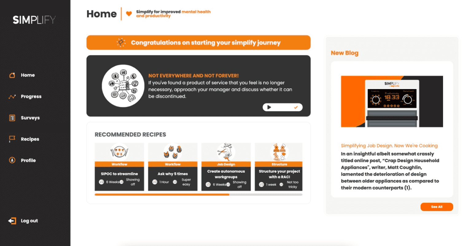
At Opposite, I led the product design and multidisciplinary delivery that transformed workplace-complexity research into a public website, learning experience, and web/mobile product enabling individuals, teams and organizations to identify complexity, access practical strategies, understand their simplification style and track progress.
Activities
300+
research-informed
Personality types
4
simplification styles
Partners
6
organizations aligned
01 · Context
0102/08
Project Simplify explored how unnecessary workplace complexity affects mental health, wellbeing and productivity. The broader initiative brought together WorkSafe WorkWell, Charles Darwin University, Metro Trains Melbourne, Jemena, Benny Button and Opposite.
The design challenge was to translate a substantial research program into something people could understand and use — not only a repository of findings.
02 · Translation
0203/08
The product helps users identify where complexity exists through the Simplify Framework, recognize their simplification personality type, access more than 300 research-informed activities and strategies, and track progress over time.
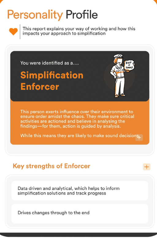
I focused on making the underlying concepts memorable and navigable. The four personality types provided an accessible entry point, while the activity library turned the research into ongoing practical value.
03 · Direction
0304/08
The experience used progressive disclosure so users could move from a simple idea into deeper evidence and activities without being overwhelmed. Content, illustration, interaction and navigation worked together as one learning system.
The public website introduced the initiative and its findings. The product platform carried users from awareness into repeated action.
Interface · Guided web experience
Desktop
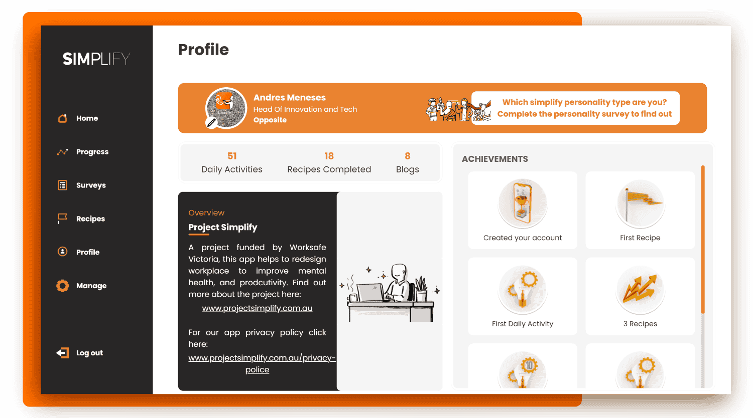
The research program becomes a guided journey: daily activity, recommended practices and visible progress.
04 · Platform
0405/08
The ecosystem combined profile, framework, 300+ activities, calendar and progress tracking across desktop and mobile. Every layer served the same underlying research model, so users never had to translate between marketing language and product language.
05 · Leadership
0506/08
As Head of Innovation & Technology at Opposite, I managed three developers and three designers while contributing directly to product structure, interaction design, visual communication and delivery decisions.
My role connected stakeholders, researchers, content, design production and technical implementation across a broader initiative valued at approximately AUD $1 million.
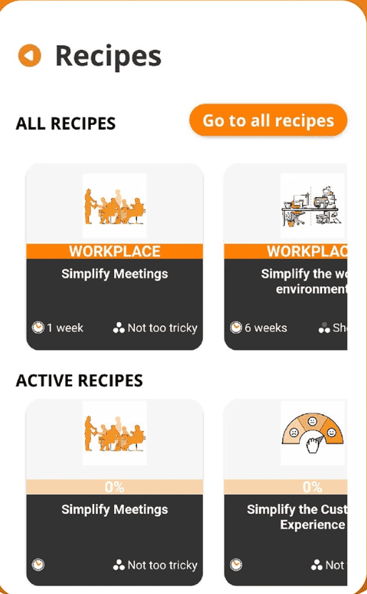
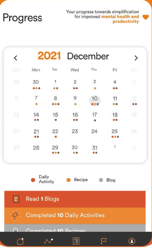
Interface · Mobile ecosystem
Mobile
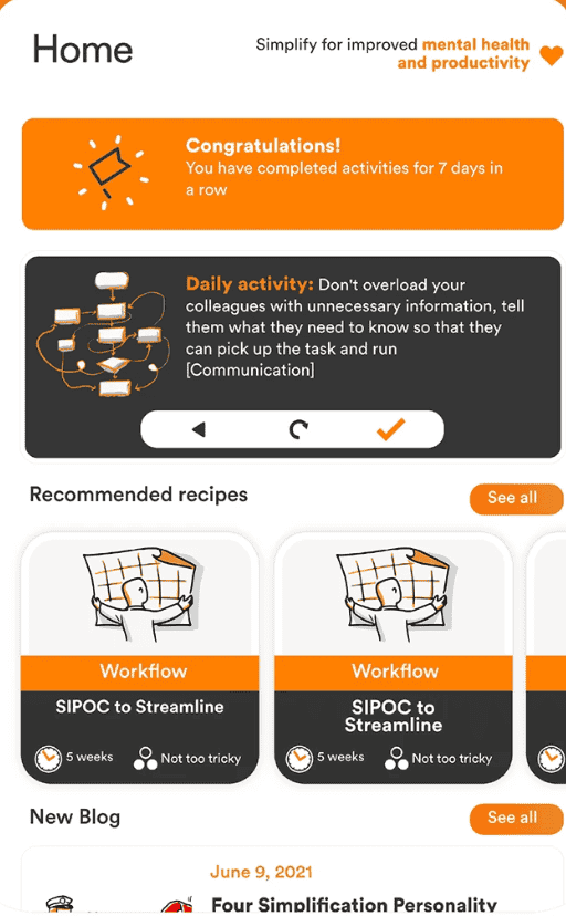
The same system on mobile: personality report, recipe library and a progress calendar that keeps the habit alive.
06 · Value
0607/08
The finished ecosystem made the initiative available across desktop and mobile and converted research into more than 300 practical activities, a framework, personality types and progress tools. Adoption metrics aren't publicly available, so the case emphasizes verifiable breadth and translation rather than invented numbers.
07 · Reflection
0708/08
Project Simplify established a pattern that continues in EstarMed and BEOND: my strongest work makes a difficult system understandable without flattening the reality behind it.
Live product
See the work in its real context.